Mental Health, Streaming, Mobile App - 2024
Kewaar
Rebuilding the product structure of a meditation app after design and development drifted apart
Product
Mindfulness Mobile App
Surface
Mobile (iOS / Android)
Constraints
Fragmented design history
Design-dev mismatch
Undefined PRD
Overview
Kewaar is a science-based meditation app designed to help users build mindfulness habits through guided sessions, structured courses, and relaxation content.
When I joined the project, the product was already in development, but the design process had become fragmented. Multiple designers had worked on the app before, and the final implemented product no longer matched the Figma designs.
The goal wasn't to polish screens. It was to rebuild the product structure and restore alignment between design and development.

Design and development had drifted apart
Figma designs and the implemented product no longer matched. Developers lacked a reliable design reference, creating inconsistencies across the app.
The product had no structural foundation
Key flows like onboarding, discovery, and content access were not clearly defined, forcing design decisions to be made reactively.
Multiple designers created fragmentation
Previous design attempts introduced different patterns and visual directions, leaving the product without a cohesive interaction model.
Developers had no system to implement
Without a design system or component structure, developers had to interpret designs manually, increasing ambiguity and implementation errors.
Core product rules were still undefined
Business rules, user states, and feature hierarchy were largely missing, making it difficult to build predictable user journeys.
Multiple designers had shaped the app.
Development kept moving forward.
Design must become the source of truth
When design and development drift apart, the product fragments. Figma had to become a reliable reference that developers could implement without interpretation.
Flows come before screens
Before redesigning the interface, the product needed clear journeys: onboarding, discovery, course access, and session booking.
Systems prevent inconsistency
A design system ensured reusable components, predictable behaviors, and a consistent visual language across the entire app.
The product must respect user states
Free and premium users experience the product differently. The interface needed to clearly reflect those states.
Developers should never guess
Components, states, and interactions had to be explicit so implementation matched the intended experience.
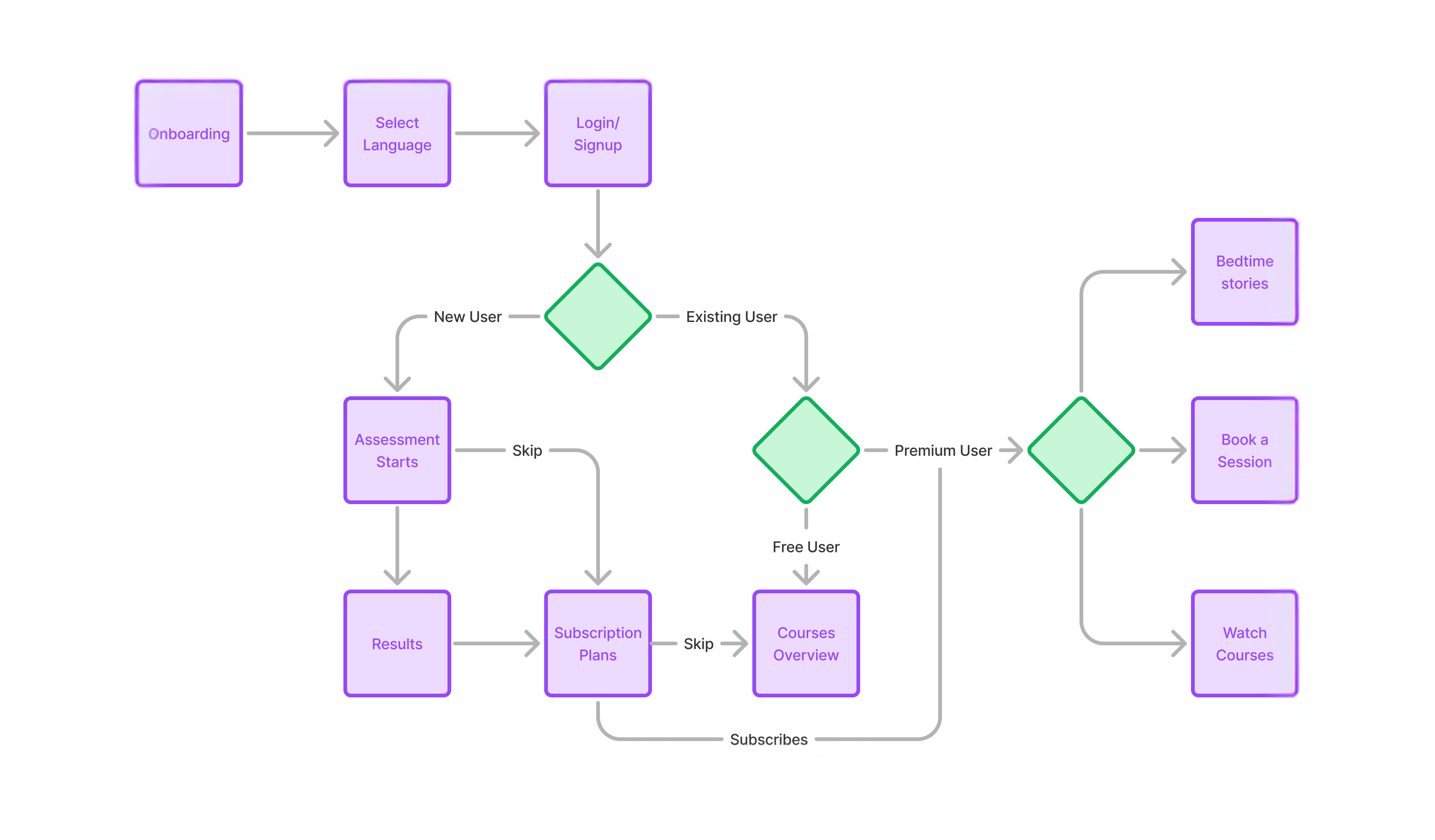
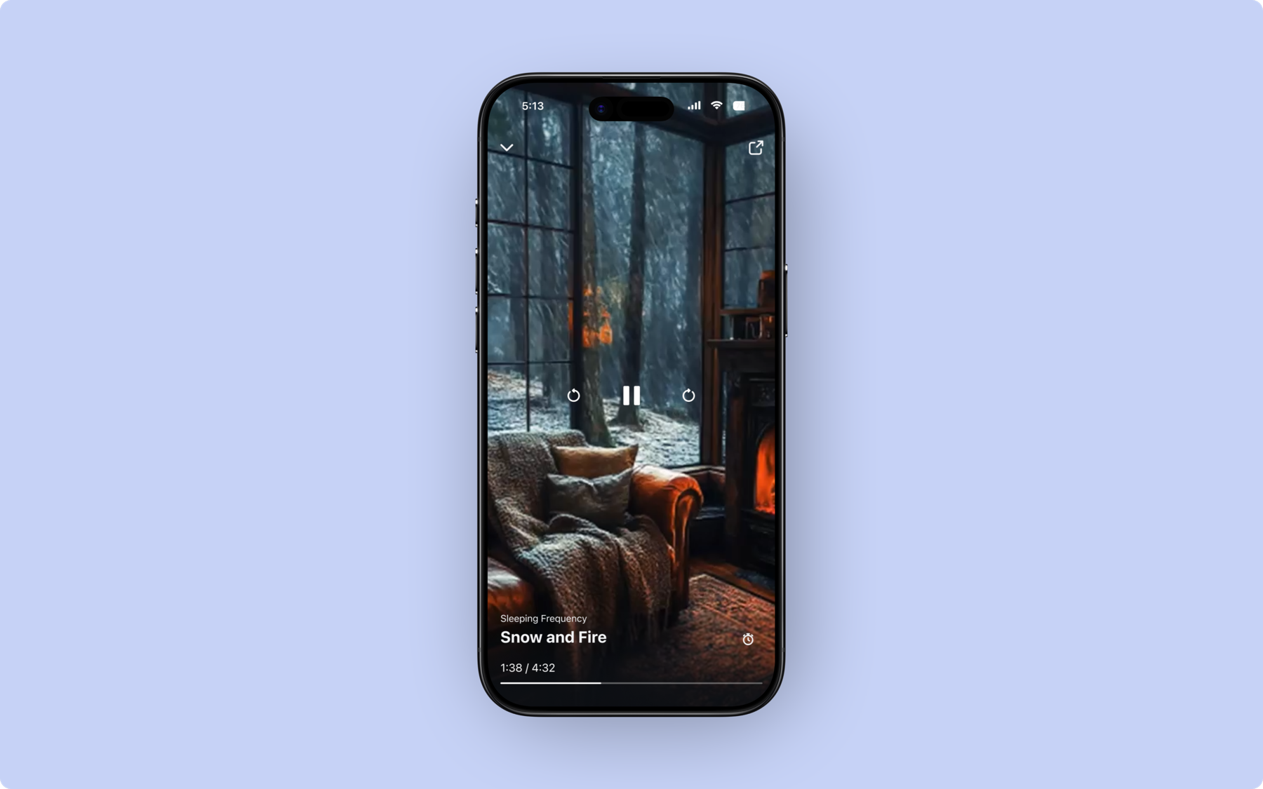
Onboarding
The onboarding experience was redesigned to clearly introduce the app and guide users into the product with a predictable entry flow.
Personalization assessment
A guided assessment was introduced after onboarding to understand user goals and tailor recommendations.
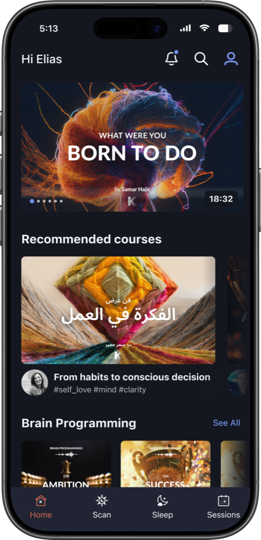
Home as the navigation hub
The home screen was redesigned to act as the central entry point to the app's content. Courses, sessions, and relaxation content became clearly discoverable.
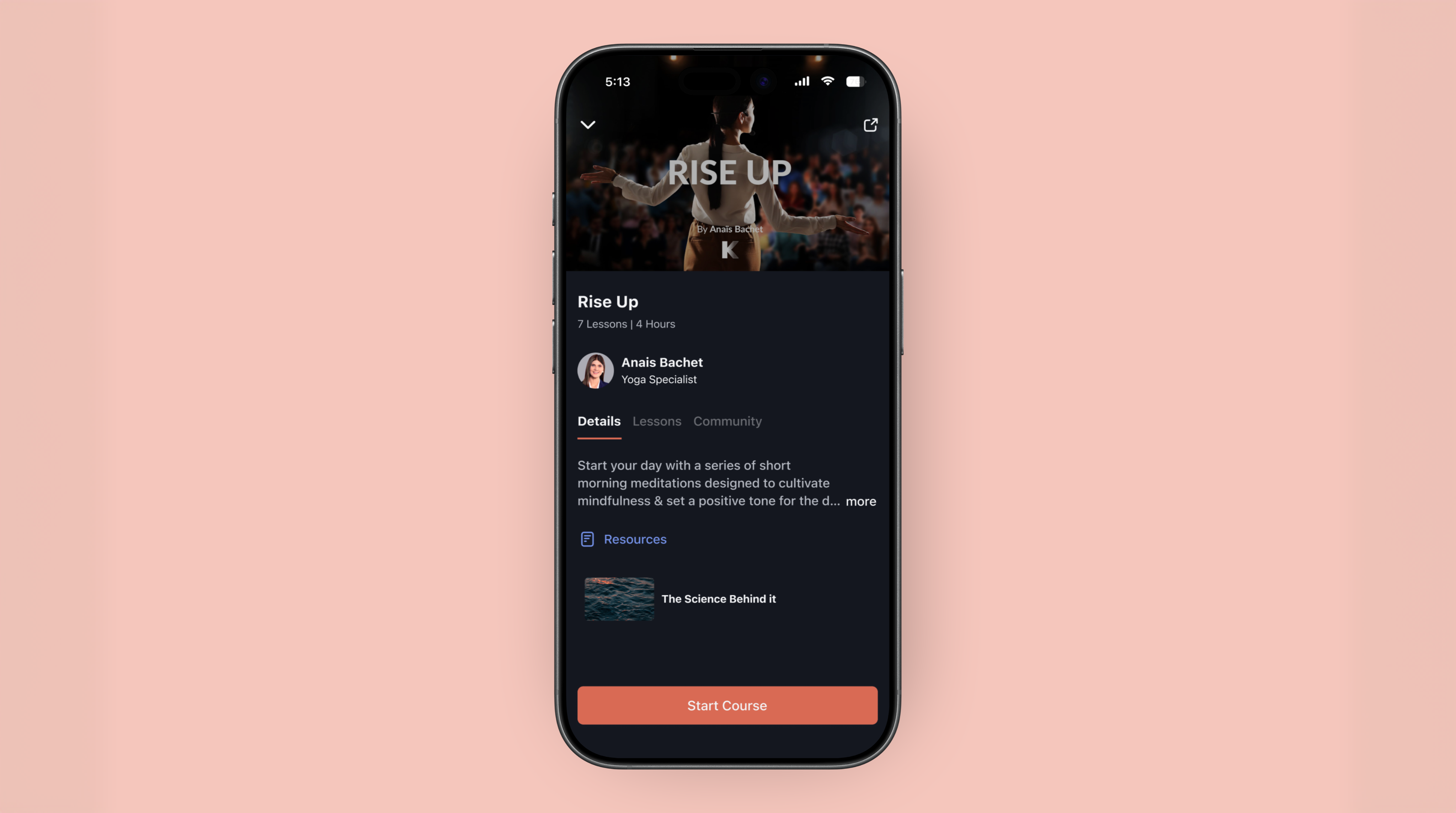
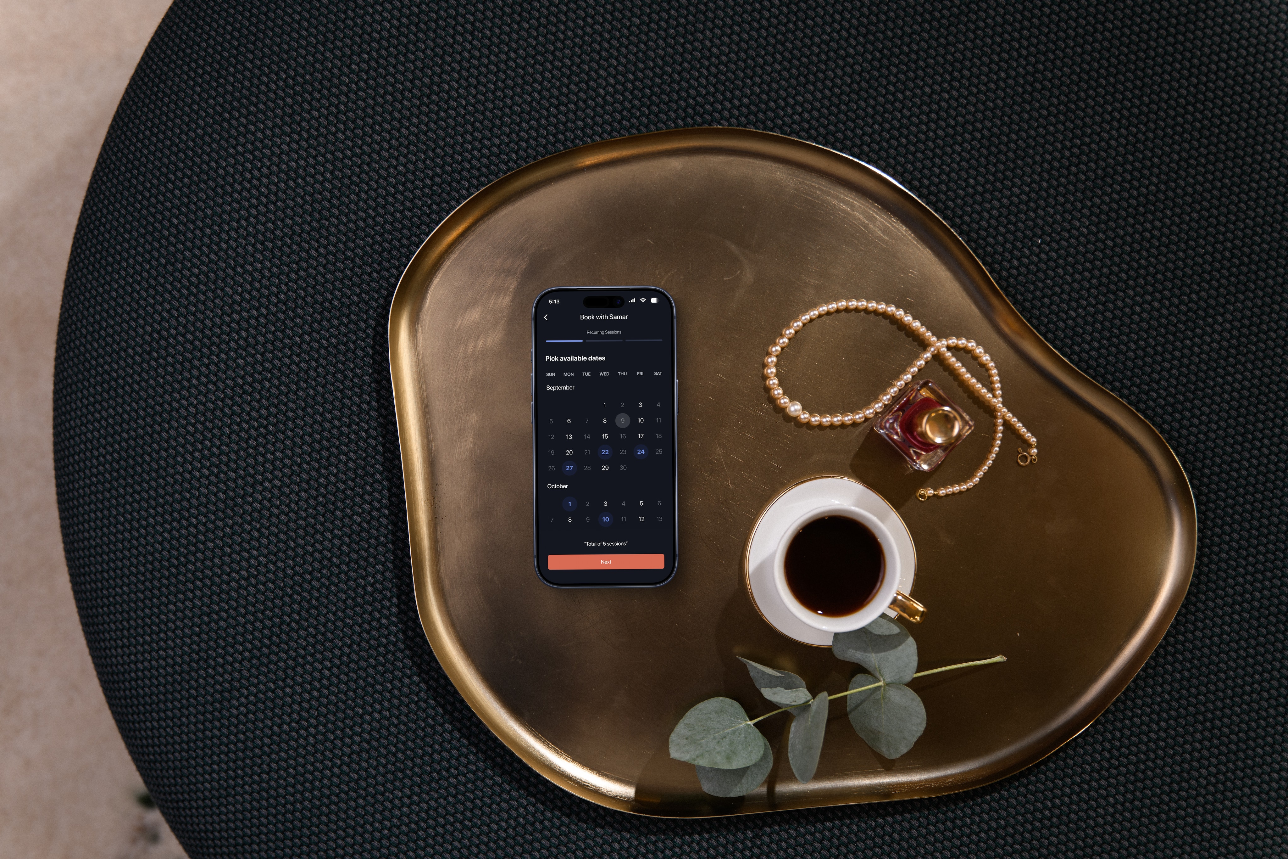
Course discovery and structure
Courses were reorganized around clear titles, trailers, and lesson structures so users could understand what they were committing to before starting.
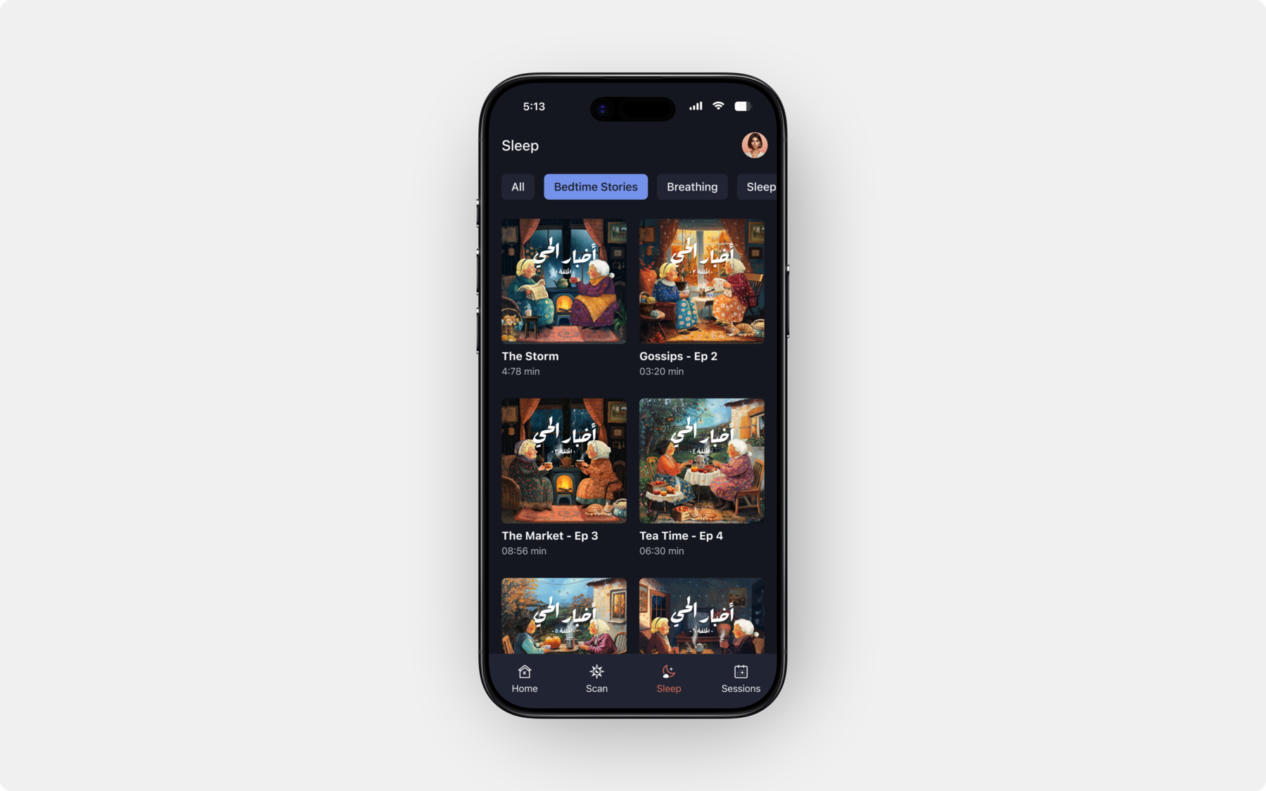
Premium access logic
The experience was structured around clear user states: free users exploring the product and premium users unlocking deeper features like courses, sessions, and bedtime stories.
Design system foundation
A full design system was introduced to standardize components, states, and interaction patterns.
Screens can look good. But products only work when they're predictable.
Restored alignment between design and development
Clear design references and structured components allowed developers to implement the product accurately.
A cohesive product experience
Previously fragmented screens were replaced with a consistent interaction model, making the app easier to navigate and understand.
Reduced implementation ambiguity
Explicit flows, states, and component structures eliminated guesswork during development, improving production reliability.
A scalable design foundation
The design system established reusable patterns and standards, allowing the product to grow without introducing new inconsistencies.
WHAT I'D CARRY FORWARD
Design must remain the source of truth
When implementation diverges from design, products slowly fragment. Clear references and shared systems keep teams aligned.
Systems prevent product drift
Without a design system, every new screen risks introducing inconsistencies. Systems create predictability for both users and developers.
Structure matters more than screens
A polished interface cannot compensate for unclear flows or undefined product logic. Architecture must come first.
Collaboration protects the product
Close communication with developers ensures that the intended experience survives the transition from design to production.