Fintech, Wallet, Mobile App - 2025
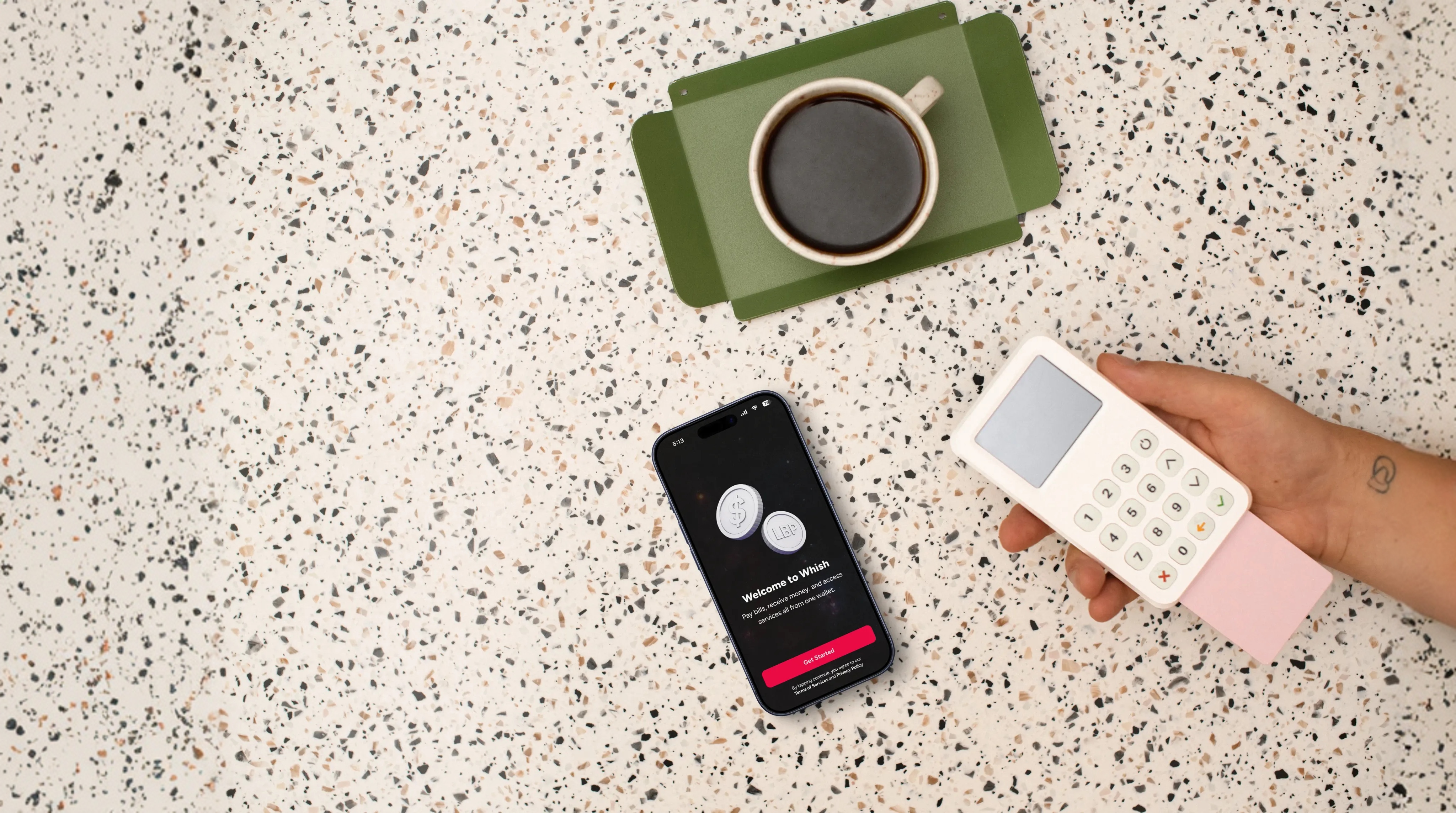
Whish Money
Reducing friction in a high-volume, multi-currency wallet without breaking existing user habits.
*Figma Make prototype
Product
Consumer Wallet
Surface
Mobile (iOS / Android)
Constraints
Multi-currency logic
Existing user habits
Live traffic
Overview
Whish is a consumer wallet used daily for payments, transfers, and services across volatile currency conditions.
At scale, small UX ambiguities don’t stay small. They turn into financial confusion, support load, and loss of trust.
This was not a visual refresh. It was a structural correction.
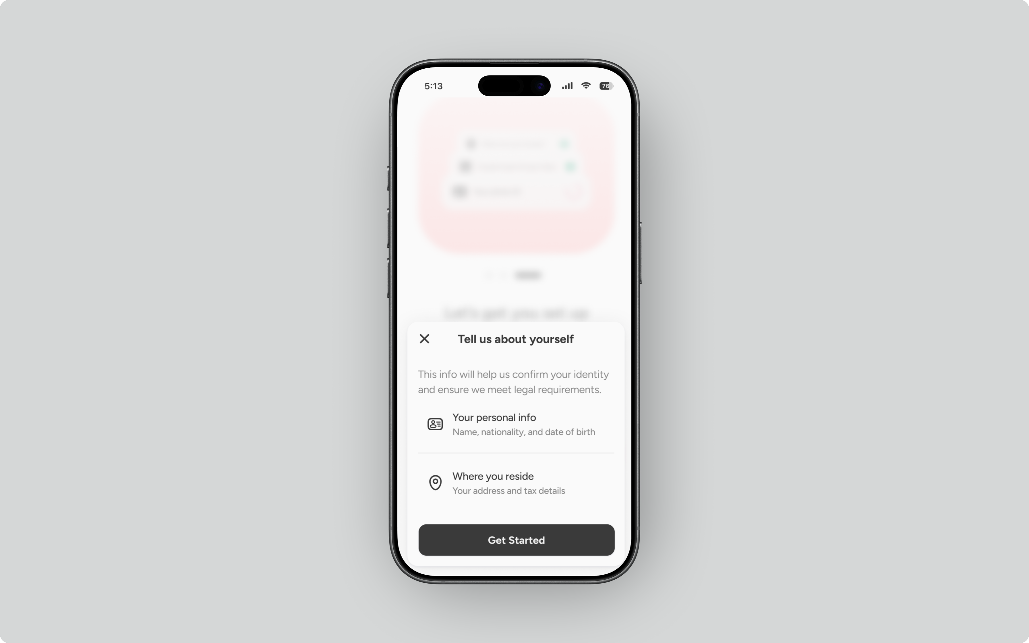
Currency context wasn’t visible at the moment of action
Users had to mentally track currency across screens, creating hesitation and errors during transfers.
The card didn’t match user expectations
USD-only logic wasn’t reinforced clearly, leading to “missing money” perceptions and loss of trust.
Services scaled without hierarchy
As the catalog grew, scan-ability dropped. Everything looked equally important, even when behavior showed otherwise.
Settings lost meaning
Preferences, financial data, and product features lived together with no clear mental model.
Brand color blurred intent
The same red signaled actions, emphasis, and errors, creating urgency where none was needed.
Whish wasn’t broken in obvious ways.
It worked. Payments went through. Services existed. Cards functioned.
Clarity beats flexibility
If users can do many things, but can’t tell what to do now, the product fails. Primary actions are obvious. Secondary actions are discoverable, not competing.
Currency belongs inside the action, not around it
Money decisions shouldn’t require memory. Currency context lives inside the transaction, not in headers, settings, or mental overhead.
Trust is visual before it’s logical
Users decide whether to trust money products before they understand them. Balances, cards, and limits must look trustworthy at a glance.
Scale must reduce noise, not add it
Growth shouldn’t make products louder. As services scale, hierarchy becomes more important than novelty.
Brand supports action, it doesn’t shout
Brand color is reserved for intent. Errors, alerts, and confirmations use semantic color; never brand red.
System rules replaced isolated fixes
Every change had to reinforce a shared logic across currencies, services, and future features.
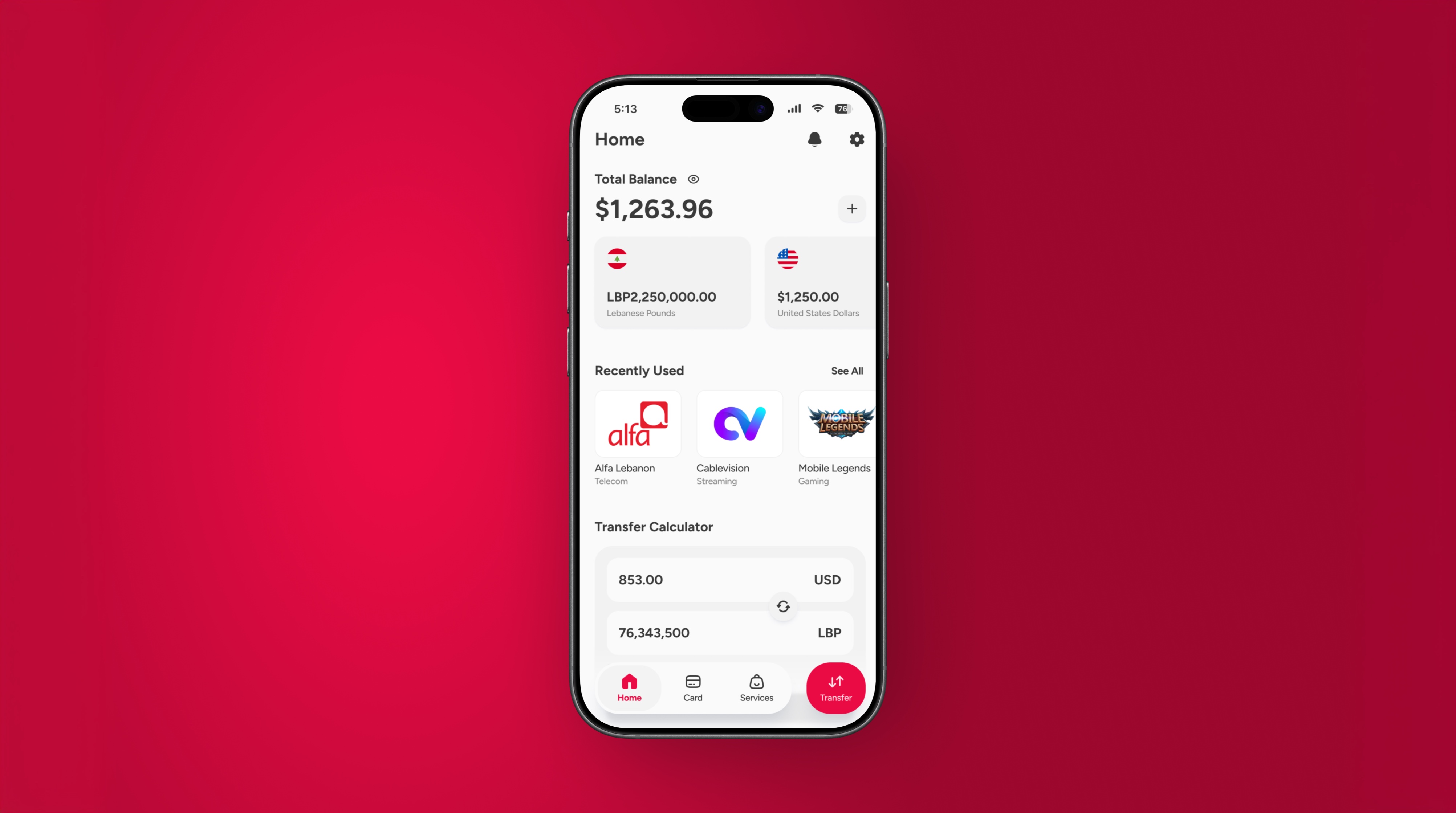
Home
A clear hierarchy restored the home as an entry point, not a dashboard.
Send flow
Currency moved inside the transaction, where decisions actually happen.
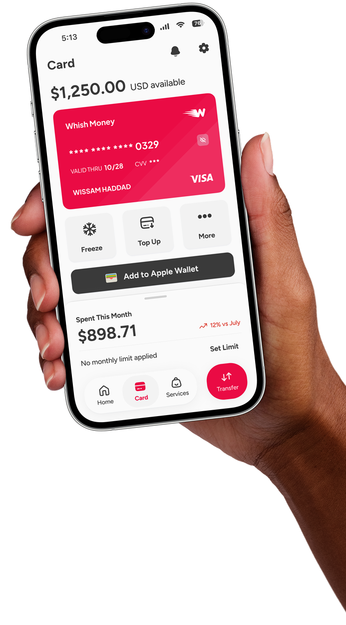
Card
Constraints surfaced clearly, with conversion and top-up actions in-context.
Services
Search and “Recently Used” led discovery, not the catalog.
Settings
Responsibilities were separated and predictable again.
Systems outlive screens
Every solution needed to scale across currencies, services, features, and future products.
WHY THIS MATTERED
Once the foundation is in place, improvements stop being isolated fixes.
Faster, more confident money decisions
Clear hierarchy and in-flow currency context reduced hesitation during critical transactions.
Restored trust around card balances
Explicit constraints replaced perceived loss with understandable behavior.
Improved service discoverability
“Search” and “Recently Used” aligned the product with real usage patterns, not catalog structure.
Reduced friction for future changes
Shared system rules made product decisions easier to reason about and safer to ship.
*This redesign wasn’t commissioned by Whish.
It did, however, initiate several product discussions before timing and availability limited next steps.

WHAT I’D CARRY FORWARD
Currency logic is product architecture, not UI
Treating it as a visual concern guarantees downstream confusion.
Ambiguity compounds faster than features
Small, unresolved decisions quietly stack until trust erodes.
Prototypes should feels deployable
AI no-code, accurate, prototypes accelerated alignment and earned executive-level buy-in.
Conviction scales through shared rules
Shared system rules made product decisions easier to reason about and safer to ship.